How to Choose the Best Hotel DND Signs for Your Property?
Choosing the right Hotel Dnd Signs is a small decision with a noticeable effect on guest comfort, staff efficiency, and property image. A quiet door sign can prevent an unnecessary knock at 8 a.m. It can also communicate care before a guest speaks with an employee.
Industry research supports this practical focus. Oracle Hospitality and Skift Research’s Hospitality in 2025 report highlights growing guest expectations for convenient, personalized, and technology-supported hotel experiences. Deloitte’s travel industry research also shows that travelers increasingly evaluate experiences through convenience, trust, and service consistency. A DND sign cannot solve every service problem. It still matters at the door.
The American Hotel & Lodging Association’s State of the Hotel Industry reporting emphasizes operational efficiency and changing guest expectations. That context makes sign selection more important than it first appears. Materials, visibility, language, durability, and design should work together. A lightweight paper card may suit a limited-service property. A rigid, moisture-resistant sign may perform better in a coastal resort or busy city hotel. Think about the hallway.
This guide examines how to choose Hotel Dnd Signs for different property types, room layouts, and service standards. It considers guest privacy, housekeeping workflows, brand consistency, and practical maintenance. Some assumptions may need testing. A beautiful sign can still fail when its text is too small, its colors blend into the door, or its message sounds unfriendly. The best choice is not always the most expensive one. It is the sign that guests notice, understand, and use correctly.
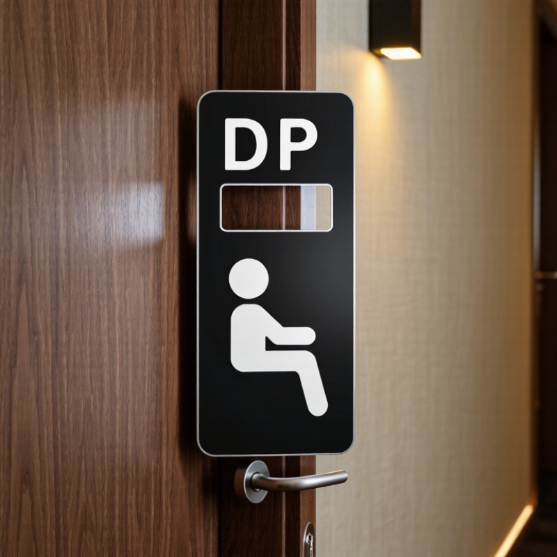
Define DND Sign Purpose and Match It to Your Property’s Service Workflow
A hotel DND sign should do more than say “Do Not Disturb.” It should fit the way your team handles room access, cleaning, and guest requests. Decide what the sign means in practice: does it pause housekeeping only, or also routine service visits? Make that distinction clear in guest-facing wording and staff procedures. A simple door sign cannot fix an unclear workflow.
Staffing data makes that workflow especially important. In its 2024 staffing survey, the American Hotel & Lodging Association reported that 76% of surveyed hotels faced staffing shortages, with housekeeping among the hardest roles to fill. When teams are stretched, a visible DND signal can help prevent unnecessary knocks and repeat visits. But it must connect to the property’s room-status process. For example, staff might record a DND room at the morning check, then follow a defined recheck time rather than guessing when service is welcome.
Keep the message readable from the corridor, even in dim light. Use clear wording, strong contrast, and a reverse side for requesting service if your workflow supports it. Train staff on what to do when a sign remains up late; do not assume every guest wants the same response. The details may need adjustment after observing real shifts. A sign that looks perfect at the desk can be confusing on a busy floor.
Separate Portable DND Door Hangers from ADA-Regulated Permanent Room Signs
Portable DND door hangers and permanent room signs serve different purposes. A hanger is a temporary guest signal: it can be placed on a handle, removed easily, and read from the corridor. A permanent room-identification sign stays fixed near the doorway. Under the 2010 ADA Standards for Accessible Design, room-identification signs are subject to requirements for tactile characters and Braille, along with placement and mounting rules. A paper hanger cannot replace that sign. Check the applicable standards and local requirements when planning installation; details such as sign location matter.
Accessibility also affects more travelers than many properties may expect. Open Doors Organization’s 2020 U.S. study estimated that 27 million adults with disabilities took pleasure or business trips in 2018, generating $58.7 billion in travel spending. That is a practical reason to keep permanent room identification legible and consistently placed. For DND hangers, choose durable, high-contrast material that remains readable under warm hallway lighting. A clear message helps staff avoid unnecessary knocks. Still, hangers can slip or disappear, so they should not carry essential accessibility information. The distinction sounds simple, but busy renovation projects can blur it. Keep the two functions separate.
Use ADA’s 5/8–2-Inch Raised-Character Range for Permanent Room Identification
How to Choose the Best Hotel DND Signs for Your Property?
A door sign can look polished and still fail as permanent room identification. For tactile room numbers, follow the U.S. Department of Justice’s 2010 ADA Standards for Accessible Design, Section 703.2.5: raised characters must be 5/8 to 2 inches high, measured using the uppercase letter “I.” This range is a clear specification, not a general design suggestion. Check the actual raised lettering, not just the artwork proof.
Keep permanent room identification distinct from a temporary Do Not Disturb message. The U.S. Access Board’s Guide to the ADA Standards also explains tactile-character and Braille provisions; review Section 703 before choosing materials or layouts. Specify raised characters, suitable contrast, and Grade 2 Braille where required. A small room number beside a handle may be hard to locate, even when its height meets the range. Details matter.
Ask the sign maker for a physical sample. Run a fingertip over the room number and inspect the Braille placement before approving a full order. A paper mock-up cannot show whether raised characters feel distinct. I have seen this step overlooked; it is easy to assume a good-looking proof guarantees a usable sign. It doesn’t. Check installation location and mounting height against applicable accessibility requirements, too.
Compare Materials, Visibility, and Durability for Your Property’s Conditions
A hotel DND sign needs to suit the door, the corridor, and the way staff work. For a busy property, coated card or synthetic stock can be practical because it is light and easy to replace. In humid coastal areas, paper may curl or soften near damp entryways. A wipe-clean plastic sign can handle moisture better, though it may feel less refined in a boutique setting. Match the material to actual conditions, not just the room’s décor.
Visibility matters during quick housekeeping rounds. Choose lettering large enough to read from several steps away, with strong contrast between text and background. A pale sign on a pale door can disappear under warm corridor lighting. Check both sides, too: guests may need different messages for “Do Not Disturb” and “Please Service Room.” Keep wording simple. Small details matter.
Durability depends on more than the material name. Frequent handling, door-edge friction, and cleaning products can wear away coatings or printed text. Rounded corners may snag less, while a reinforced hole can reduce tearing if the sign hangs from a handle. Test a sample on a real guestroom door for several days. Check whether it slips, bends, or becomes hard to read. One assumption worth revisiting: thicker is not always better; a heavy sign may fall or obstruct the handle. Choose a design that stays visible without getting in the way.
Set Cleaning, Inspection, and Replacement Criteria for Consistent Sign Performance
A Do Not Disturb sign works only when guests can read it and staff can trust it. Set a simple cleaning routine that matches the sign’s material. Wipe both sides with a soft cloth and a mild, surface-safe cleaner. Avoid soaking paper inserts or using harsh products that may fade lettering. Let signs dry fully before rehanging them; damp plastic can stick to a painted door.
Inspect signs during room checks and after housekeeping turns. Look for cracked edges, loose hanging holes, curled corners, stains, and lettering that is hard to read from the hallway. Check that the message is visible on both sides and that the sign hangs without slipping. Small defects matter. A faded “Do Not Disturb” message can be mistaken for a blank sign, especially under warm corridor lighting. Record recurring damage by room or floor so storage and handling issues are easier to spot.
Replace signs when cleaning no longer removes marks, text has faded, or the hanger no longer stays secure. Keep replacement stock in a dry, clearly labeled location, and use the same size and wording across rooms. Set a review interval, such as quarterly, then adjust it based on actual wear. That schedule may not be perfect; busy properties can wear signs faster than expected. Track replacements for a few months and revise the interval rather than relying on guesswork.
